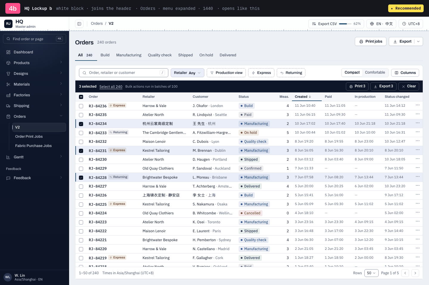
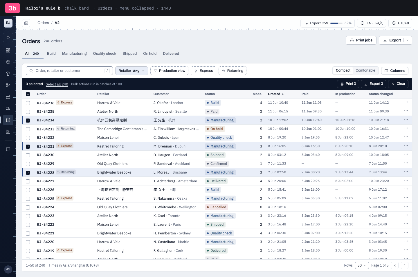
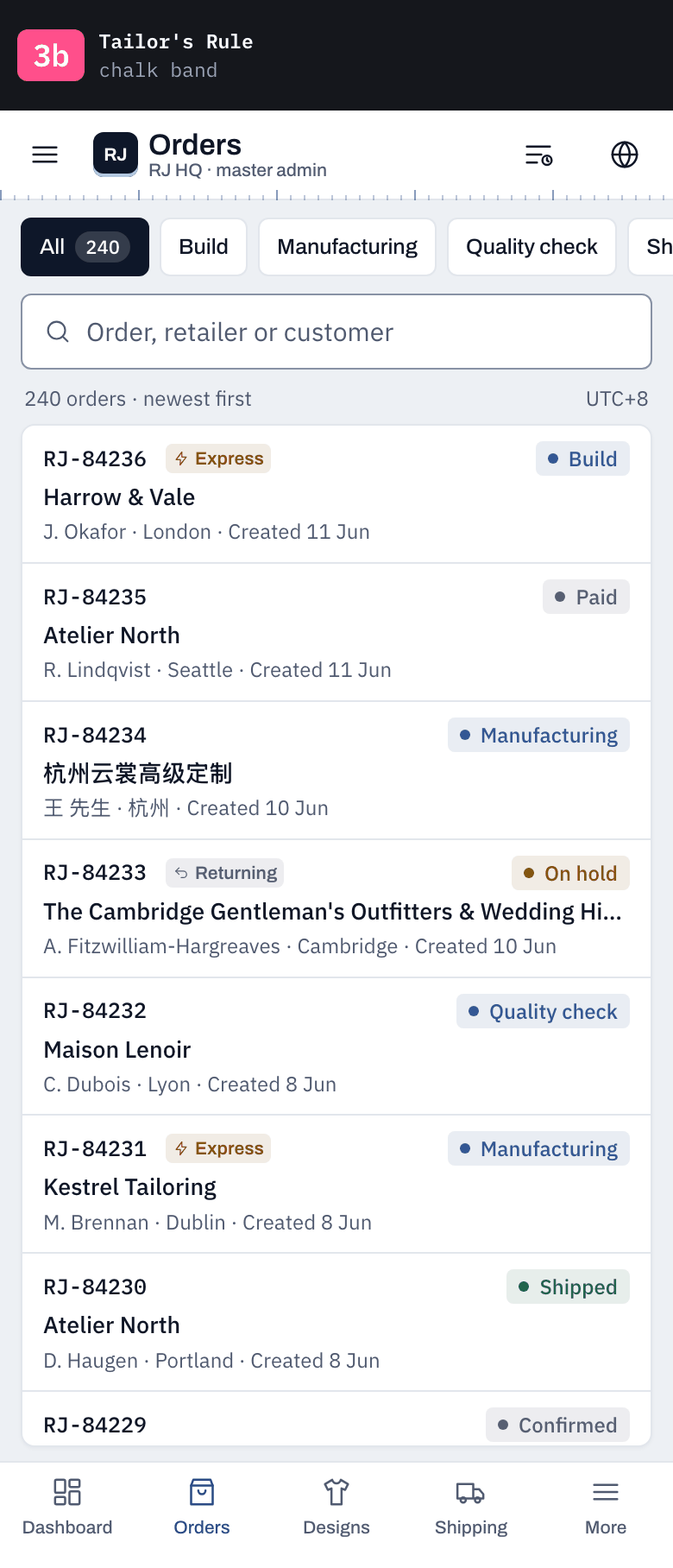
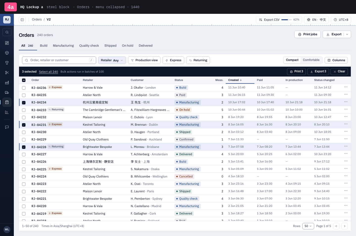
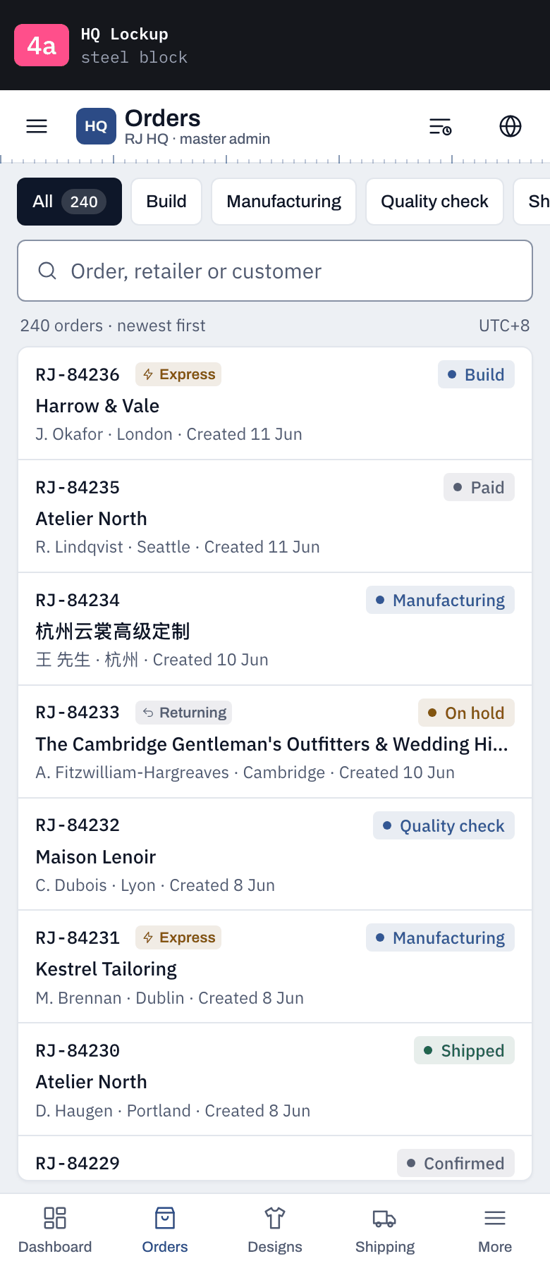
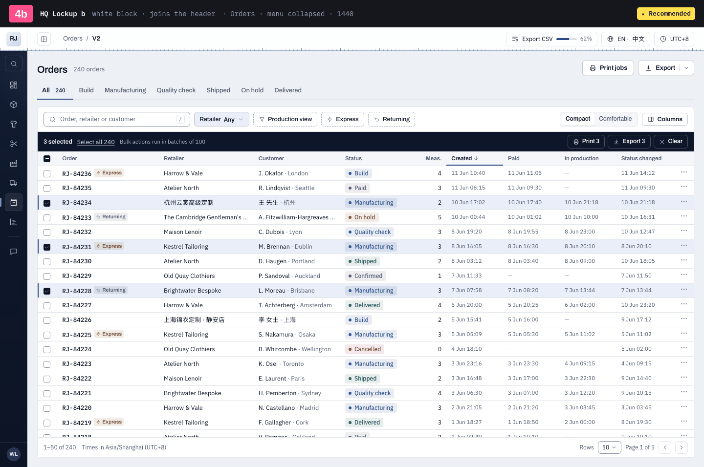
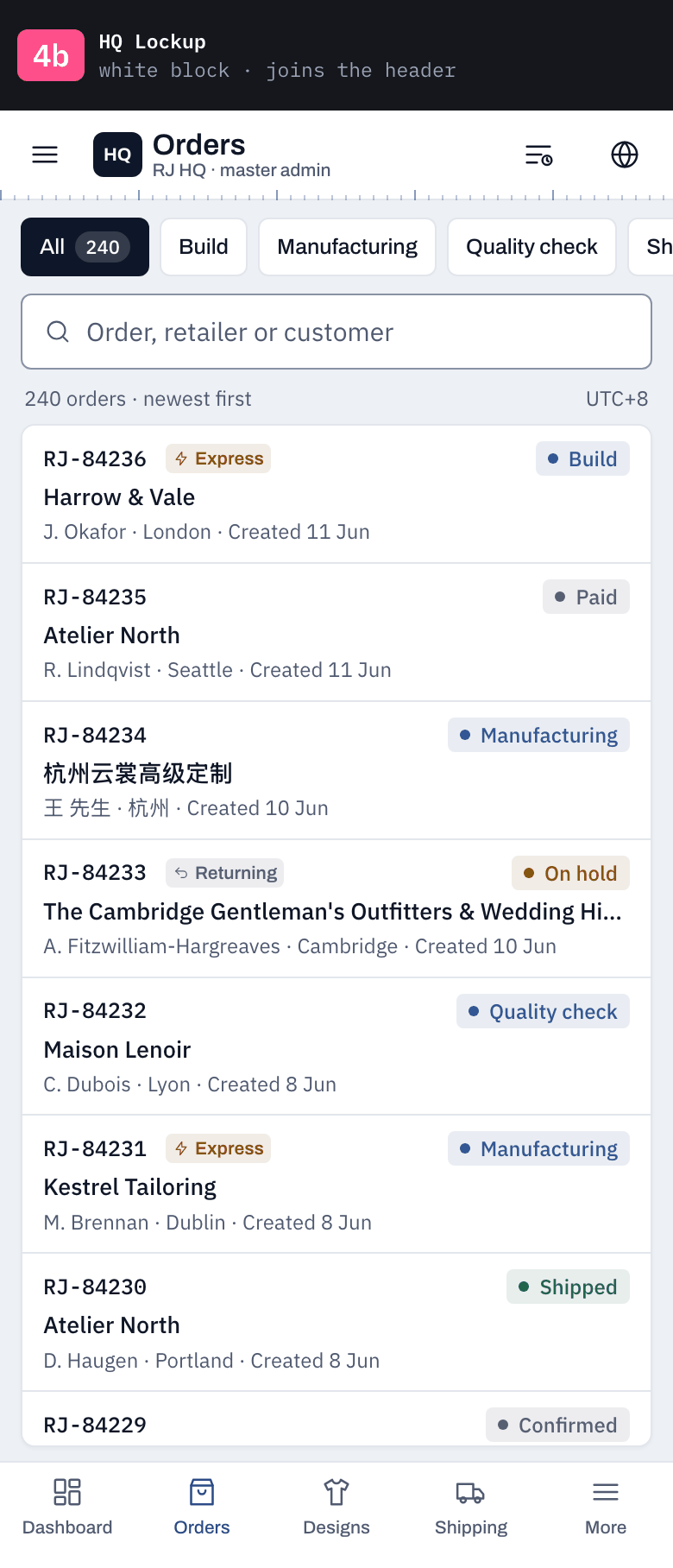
Which one: 1a, 1b, 2a, 2b, 3a, 3b, 4a, 4b? Or say your call for 4b. Every option keeps 2b's density, a navy menu, the white header and the tape.
Recommended: 4b · The one answer that still works at thumbnail size: the white header runs the full width over the navy menu, so the top-left corner (where the eye lands) is white with RJ HQ in it, while DTC's is navy. Navy sidebar, white header and tape all stay; collapse it and there is very little navy left.
Which panel am I on?
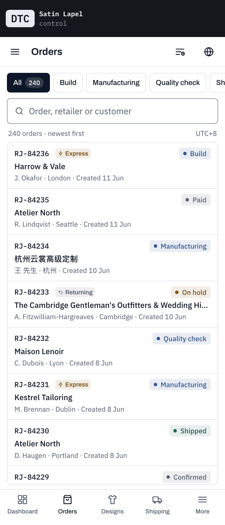
Each option as it opens, shrunk to a thumbnail, beside the DTC admin. Same data, same page. The one you can tell from DTC at this size is the one that works when you switch tabs.
DTCcontrol
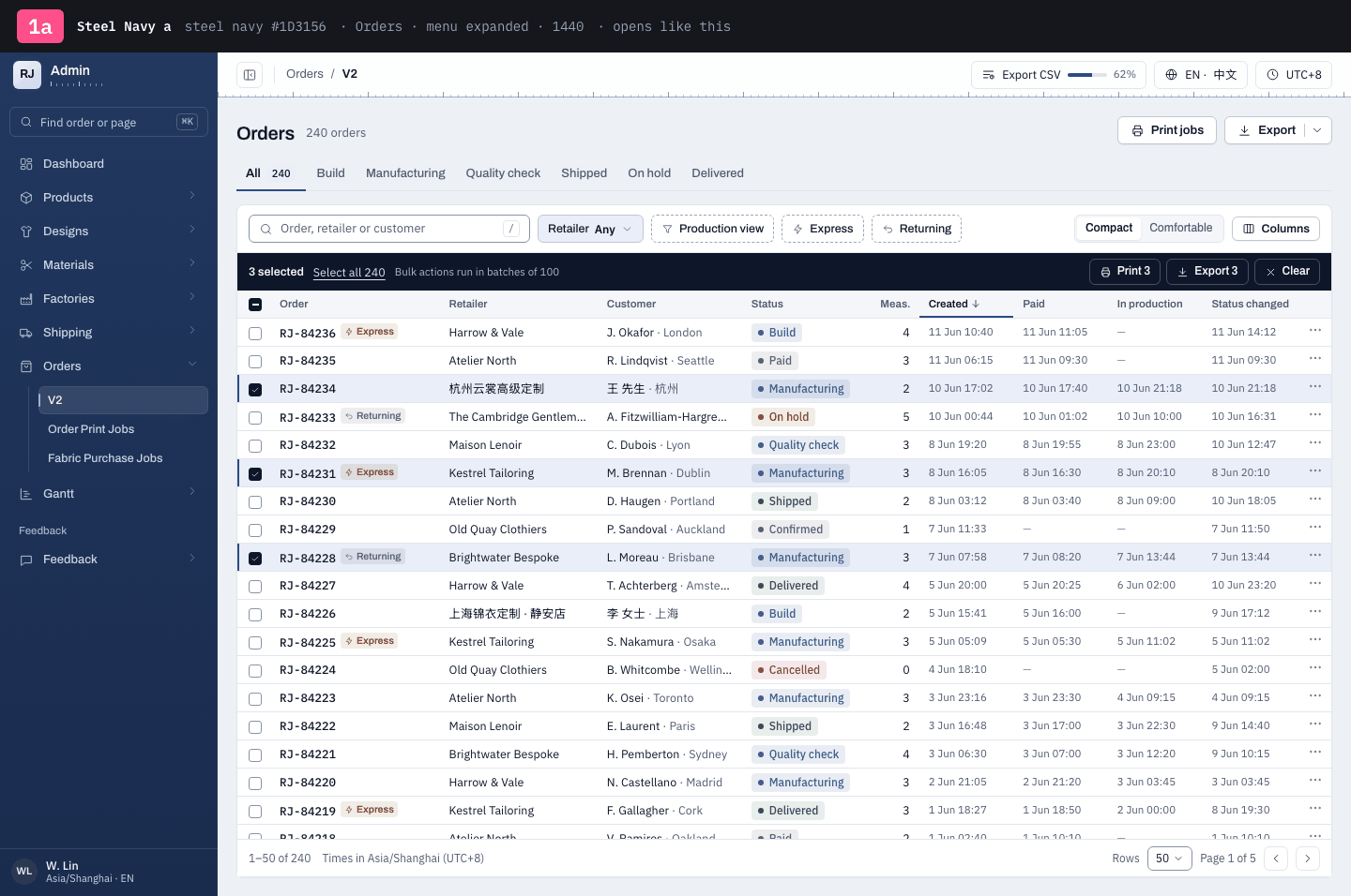
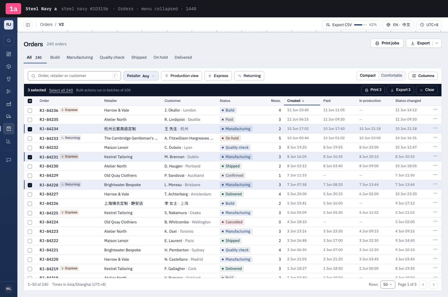
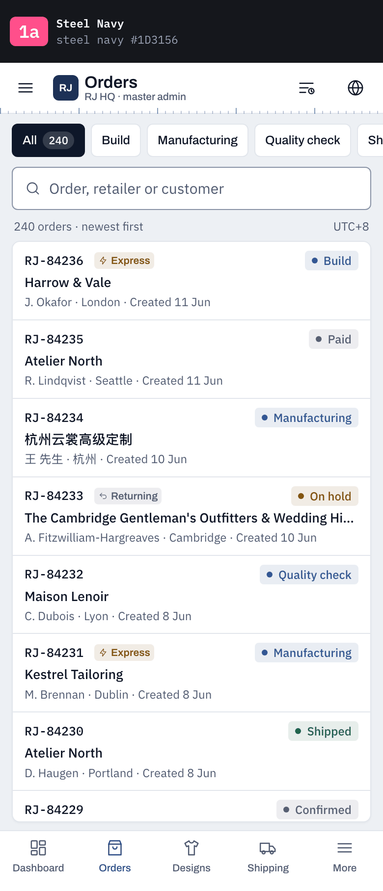
1asteel navy #1D3156
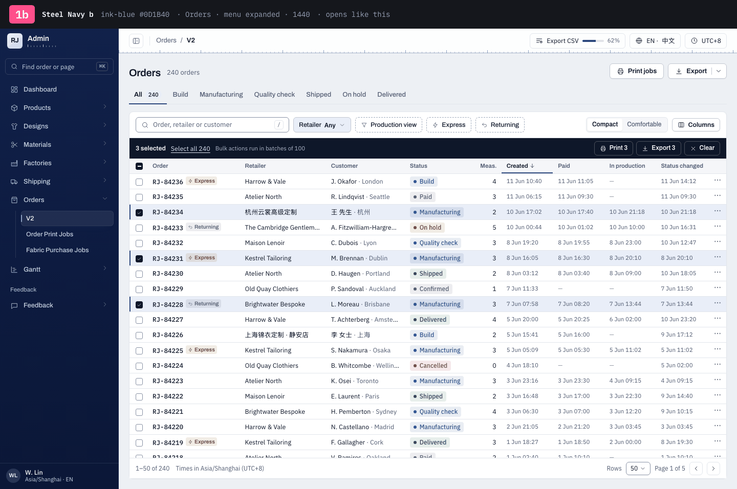
1bink-blue #0D1B40
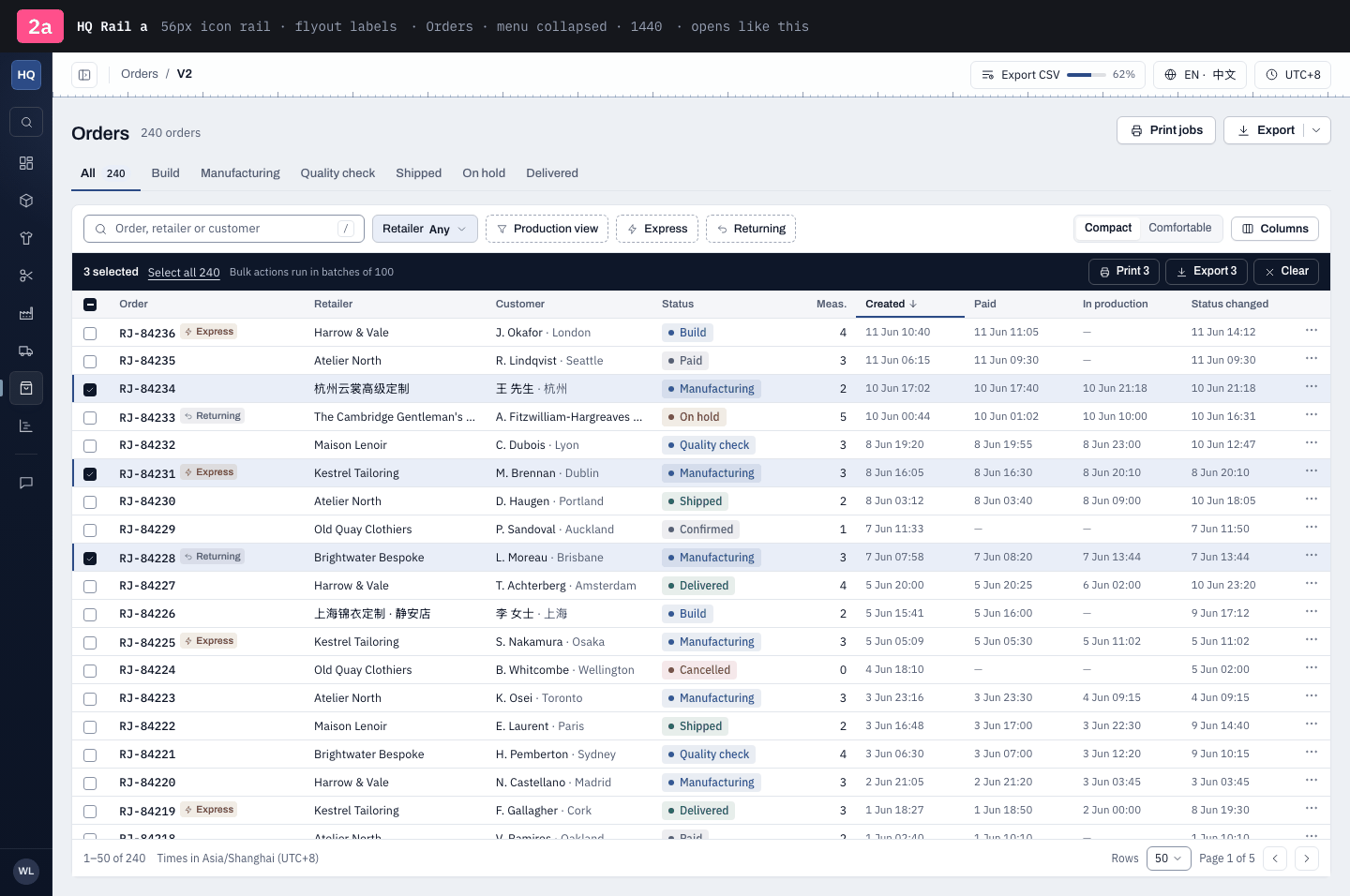
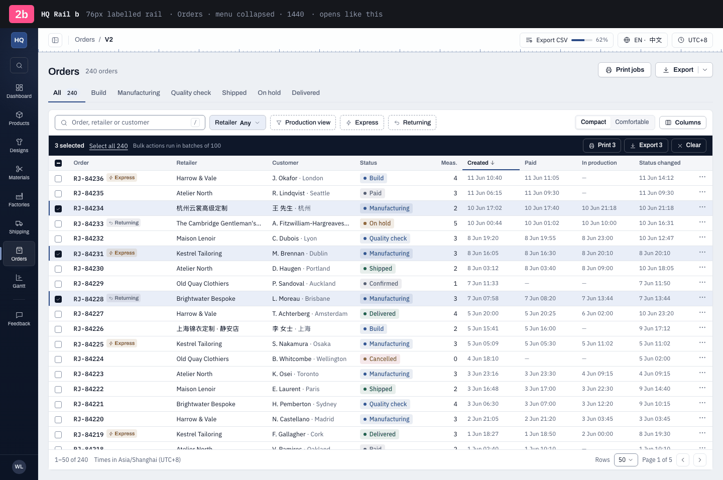
2a56px icon rail · flyout labels
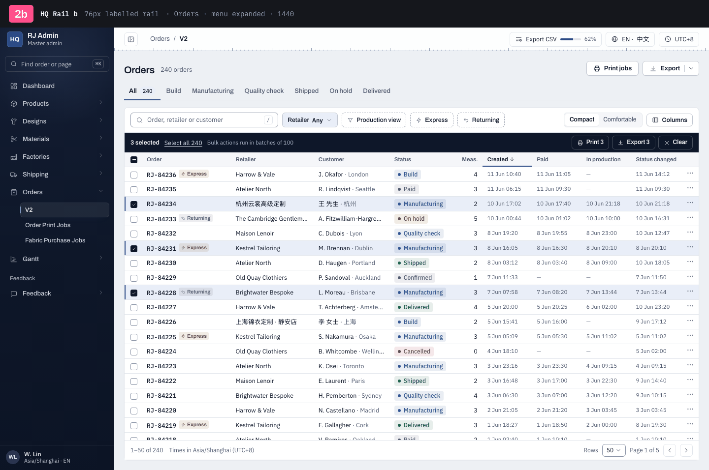
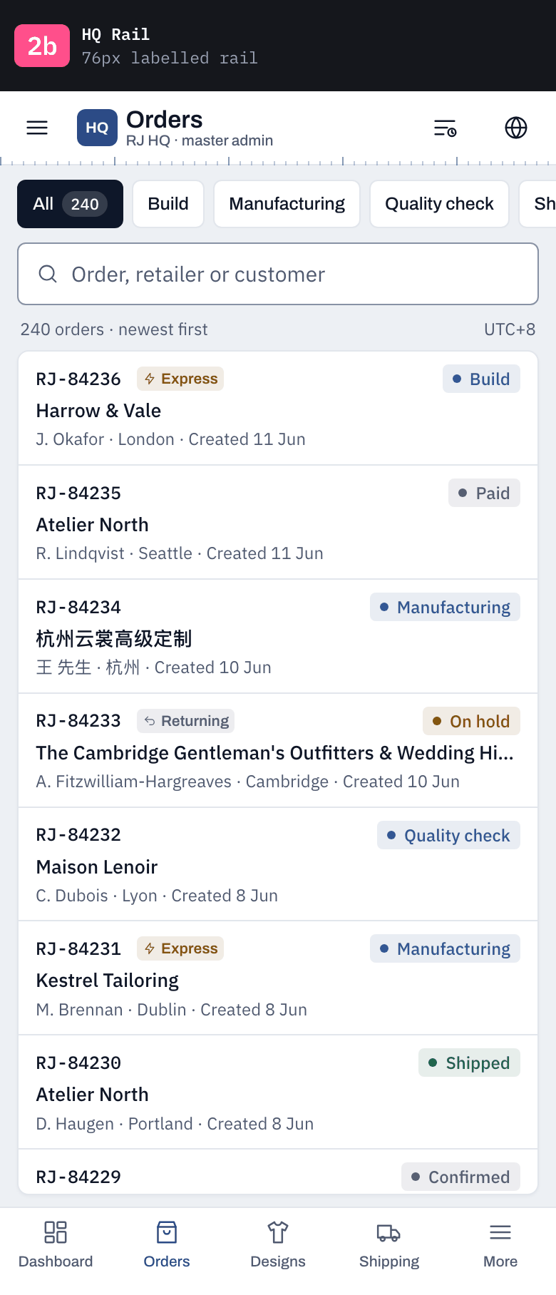
2b76px labelled rail
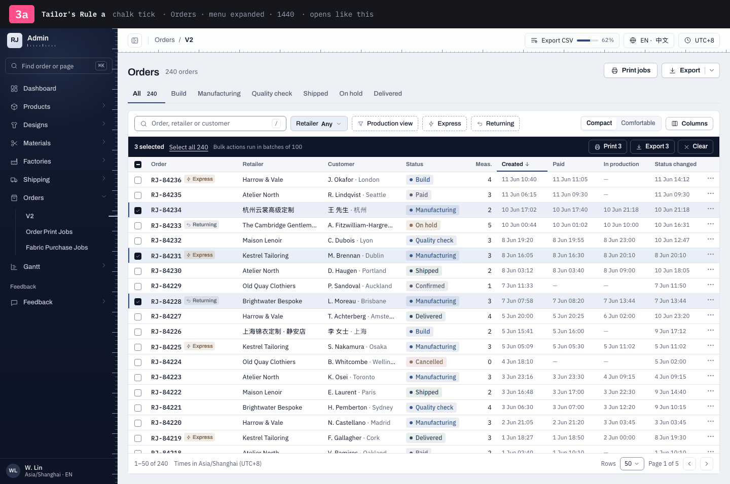
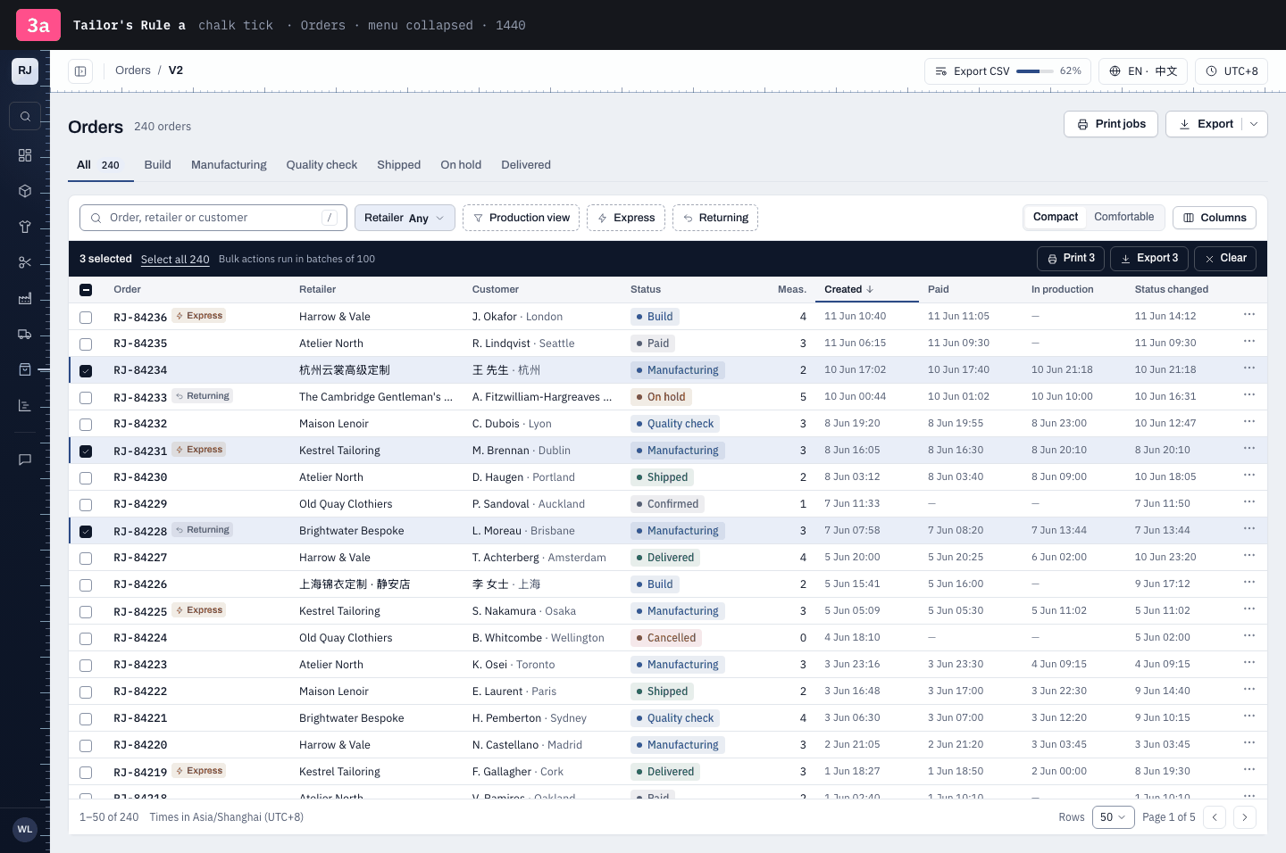
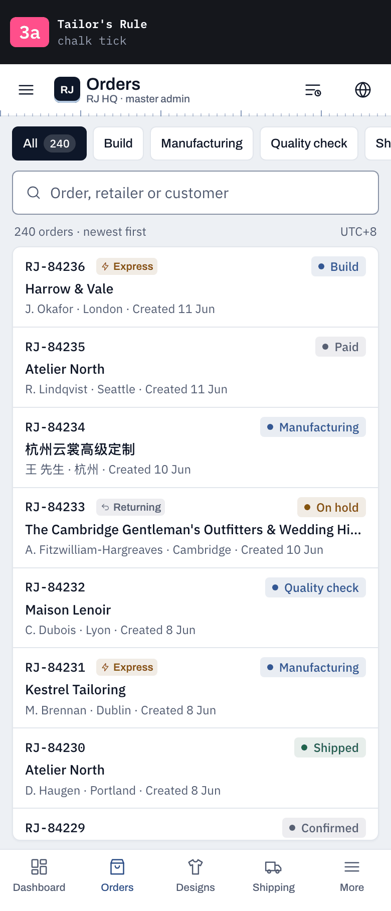
3achalk tick
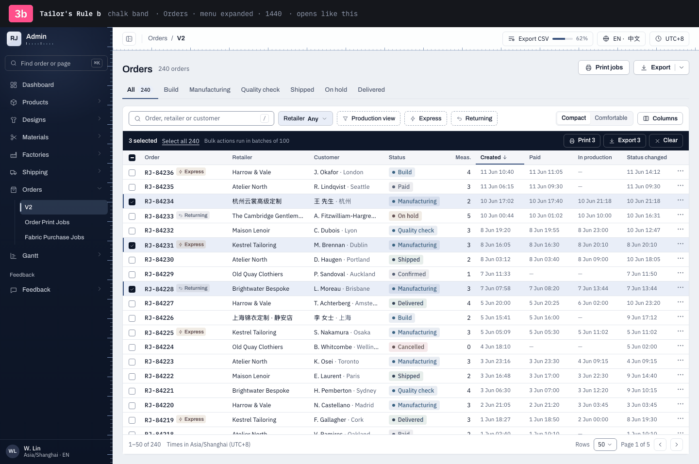
3bchalk band
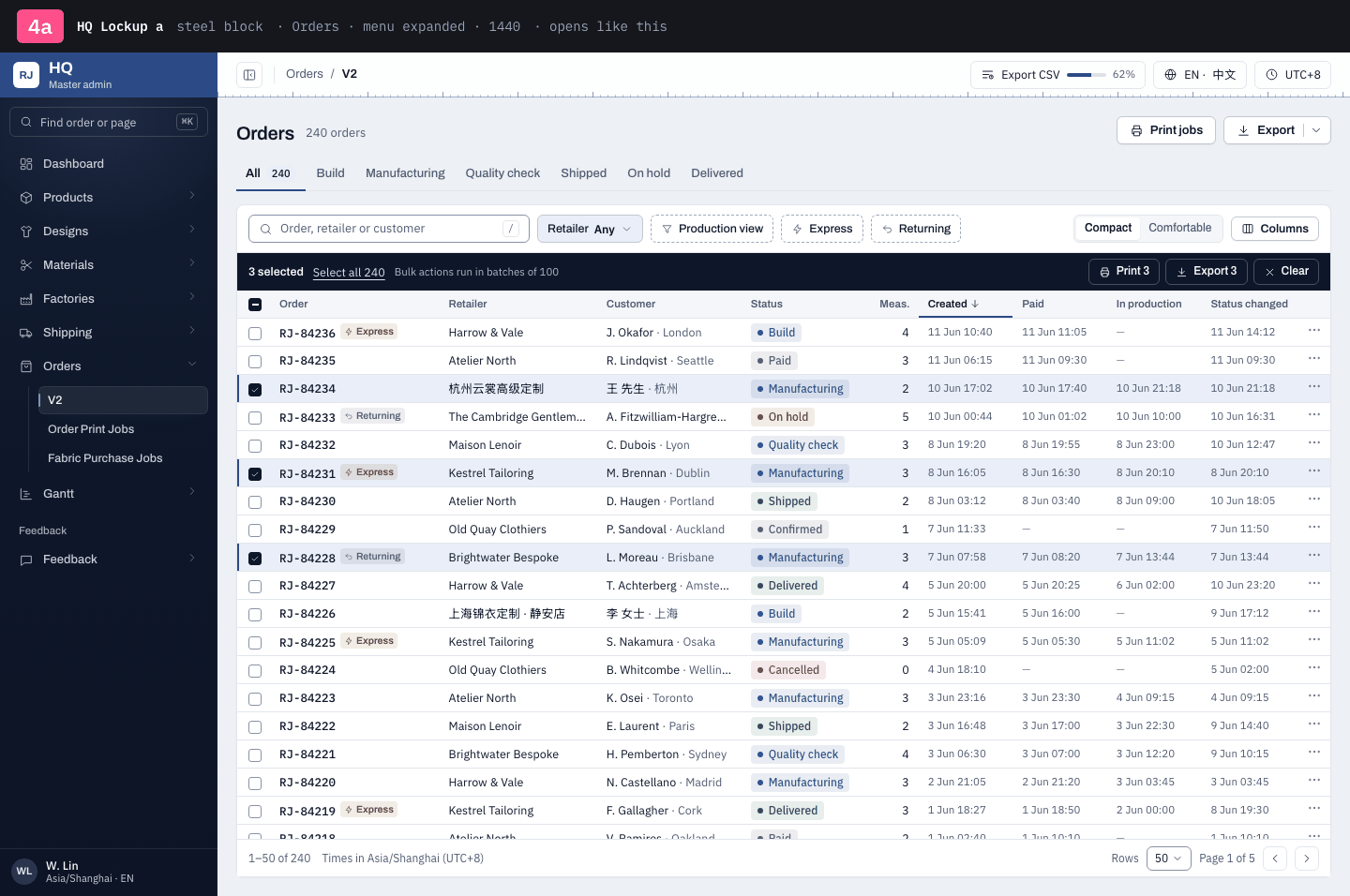
4asteel block
4bwhite block · joins the header
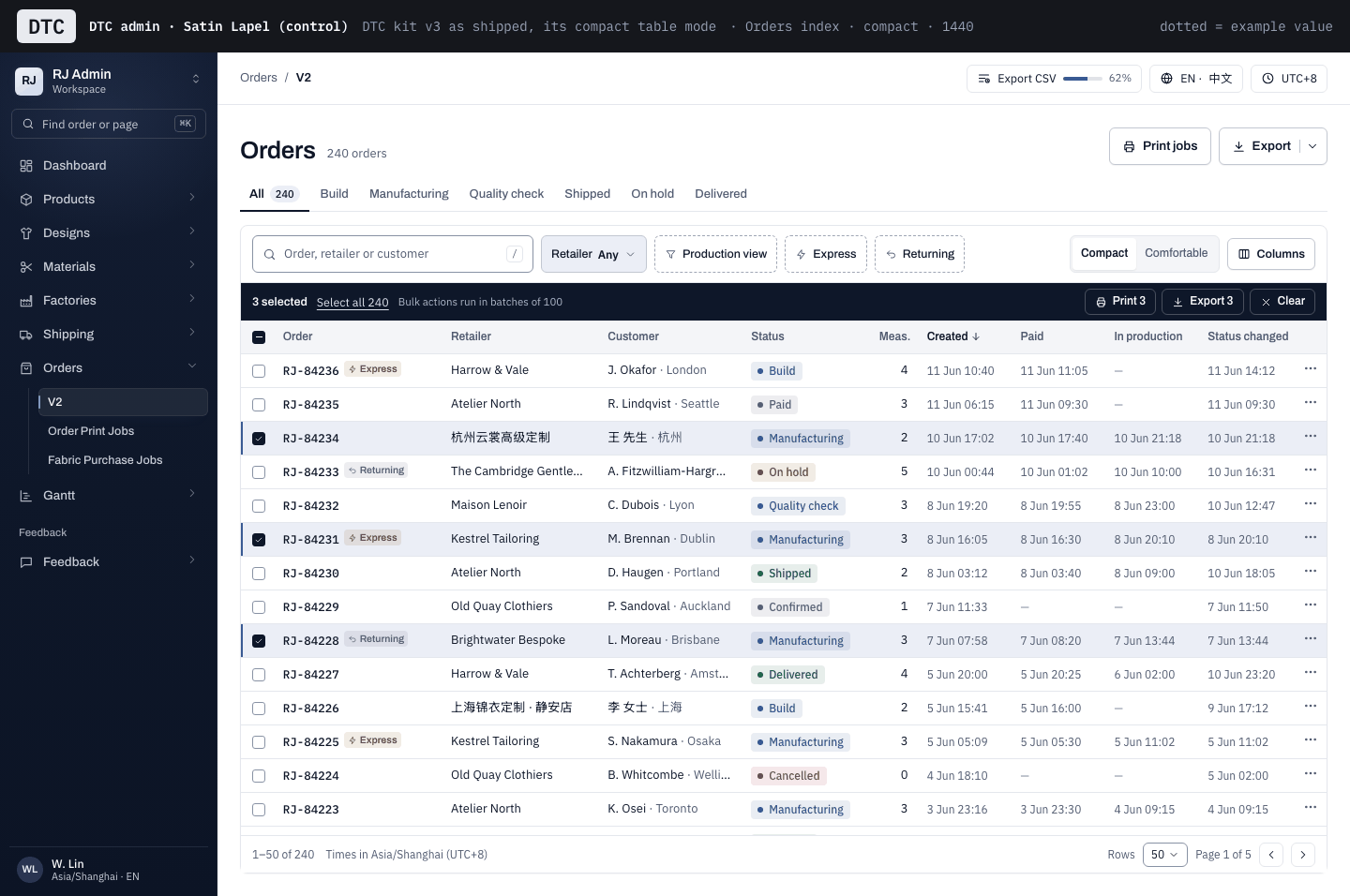
DTC · Satin Lapel (control)
The DTC admin as shipped, same data. It has no collapsed state.
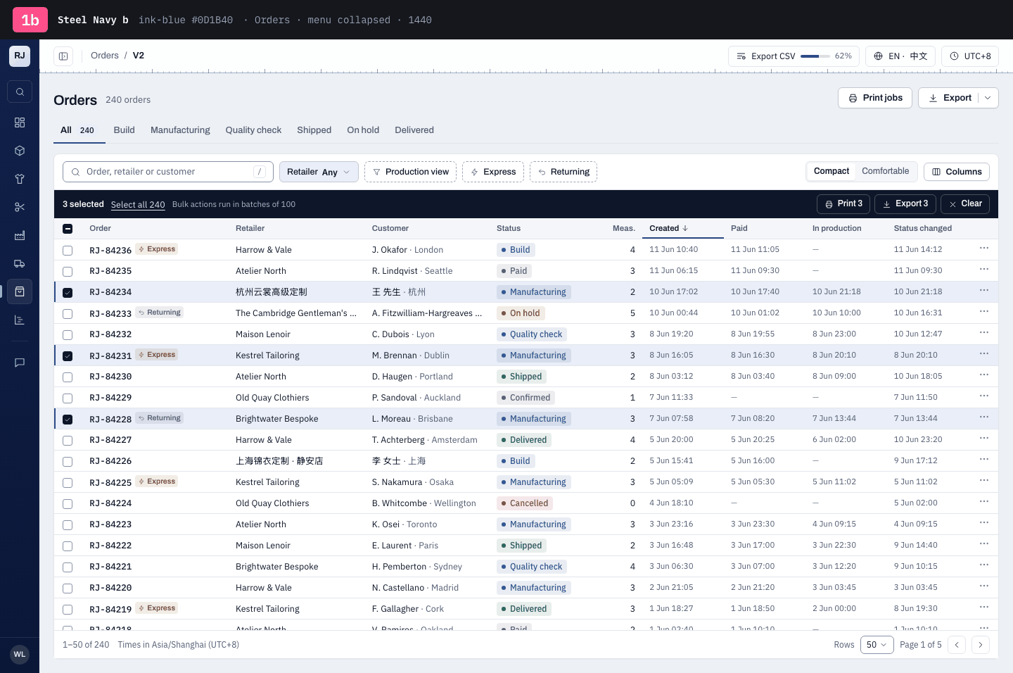
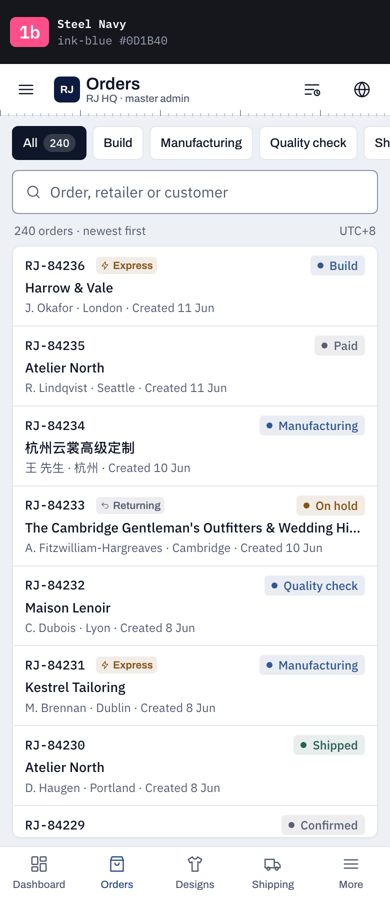
1 · Steel Navy
The sidebar moves within the navy family to a matte steel navy, so the master admin reads bluer than DTC's satin ink at a glance. Everything else is 2b.
Sidebar hue shifted within navy (sibling, not a new colour)Matte sidebar: the satin bloom is DTC's, so it goesCollapsible: 232px menu ↔ 56px icon rail; opens expandeda / b · Sidebar navy: a = steel, lighter and bluer (#1D3156) · b = ink-blue, DTC's depth but more saturated (#0D1B40)
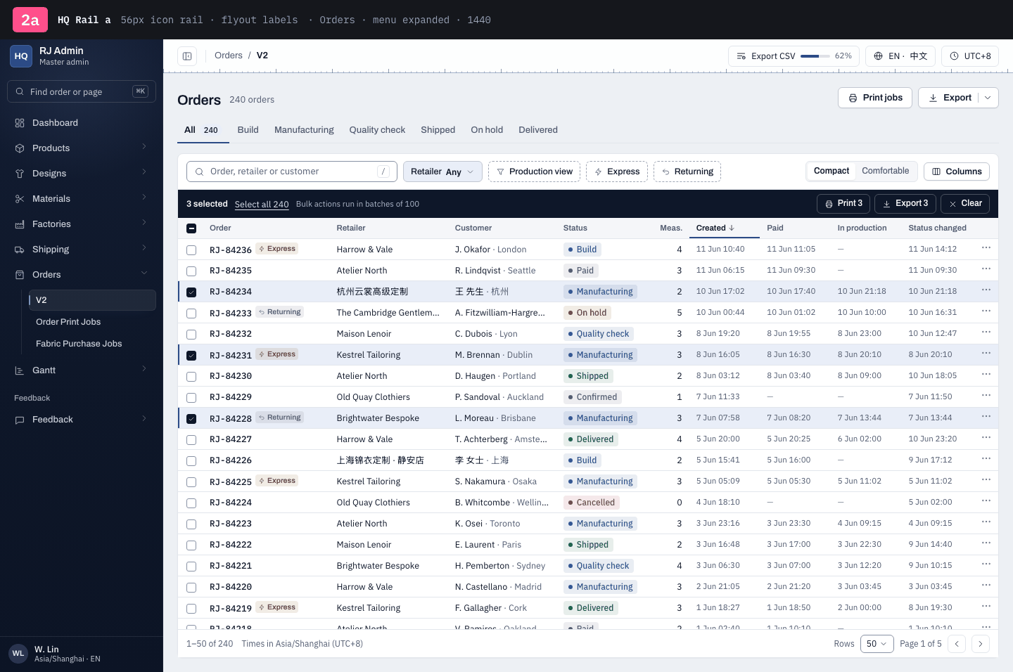
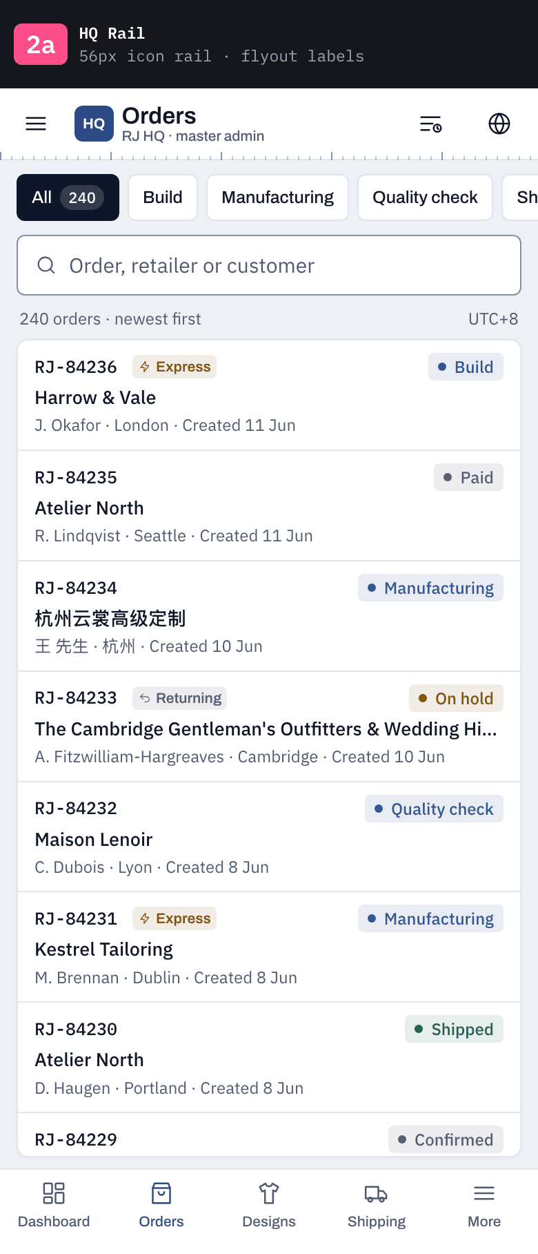
2 · HQ Rail
Collapsed by default: a narrow navy rail under a steel HQ tile; labels fly out on hover and the full menu pins open with ⌘B. Less navy on screen, and the shape alone says 'not DTC'.
Default state = collapsed icon rail (DTC is always expanded)Steel HQ tile heads the rail and the menuHover flyouts carry the labels and the group childrena / b · Rail form: a = 56px icon rail, labels in flyouts · b = 76px rail with a small label under each icon
3 · Tailor's Rule
The tape measure moves onto the navy: a ruler runs down the sidebar's edge and the active item is marked off it in chalk blue.
Tape ruler down the sidebar's right edge, in both statesChalk blue #A9C8F2 for the active item, sibling of the steelCollapsible: 232px menu ↔ 56px icon rail; opens expandeda / b · Active marker: a = a chalk tick off the ruler, no fill · b = a chalk band with a chalk rail
4 · HQ Lockup
The top of the sidebar becomes a lighter brand block with an RJ HQ lockup, aligned to the header; the navy nav sits under it.
Brand block the height of the header, lighter than the navyRJ HQ lockup + 'Master admin' (DTC shows 'RJ Admin · Workspace' + switcher)Collapsible: the block shrinks to an RJ tile over the 56px raila / b · Brand block: a = steel block (#2C4B86) · b = white block that joins the white header into one bar
Each row: Orders with the menu expanded · the same page with the menu collapsed · phone 390. Data and menu are round 1's (mock API shapes, the live orders-role menu: no badges, no role chip). Click a shot for the live frame.